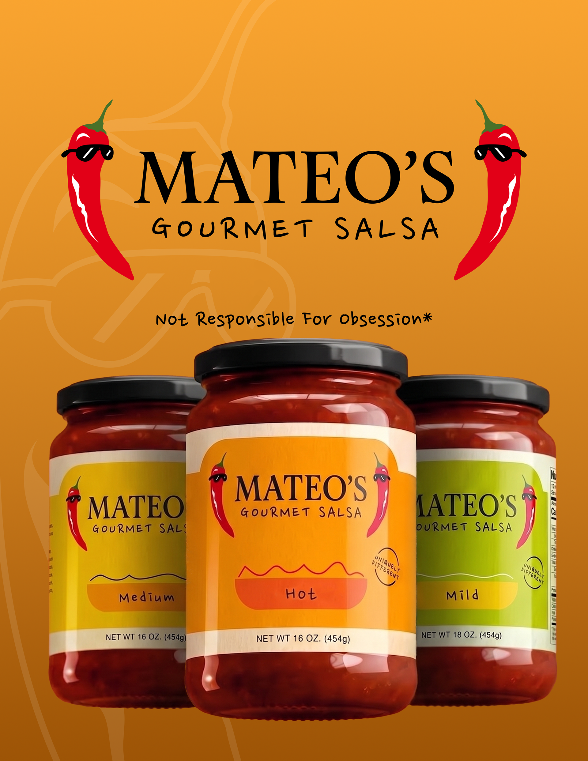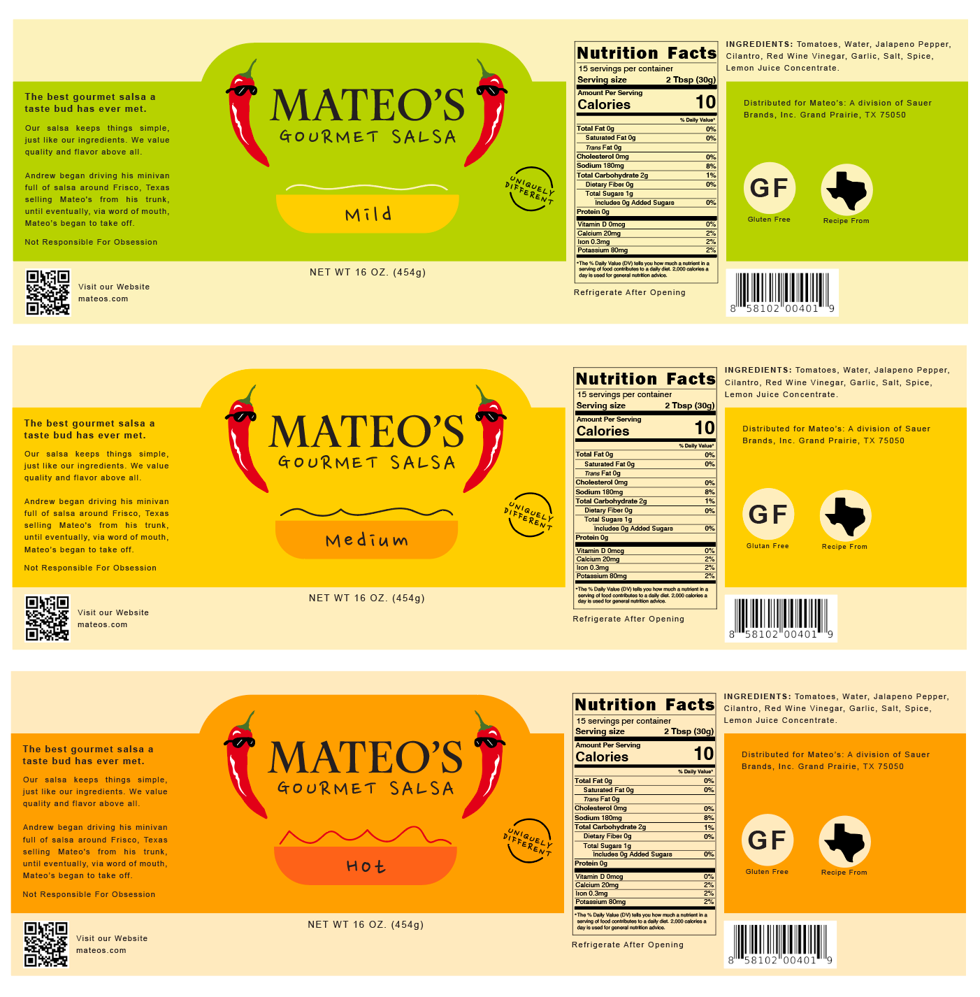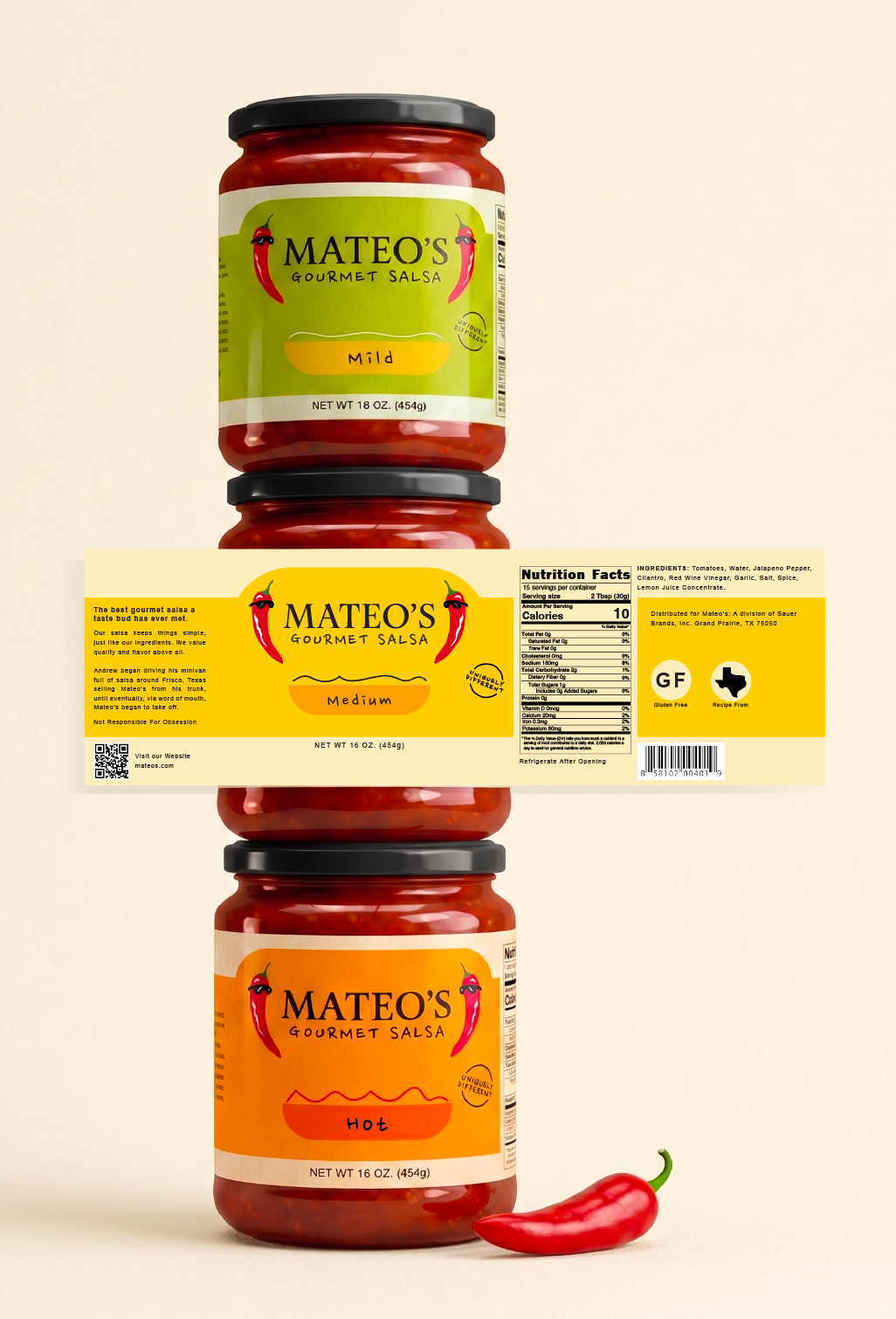
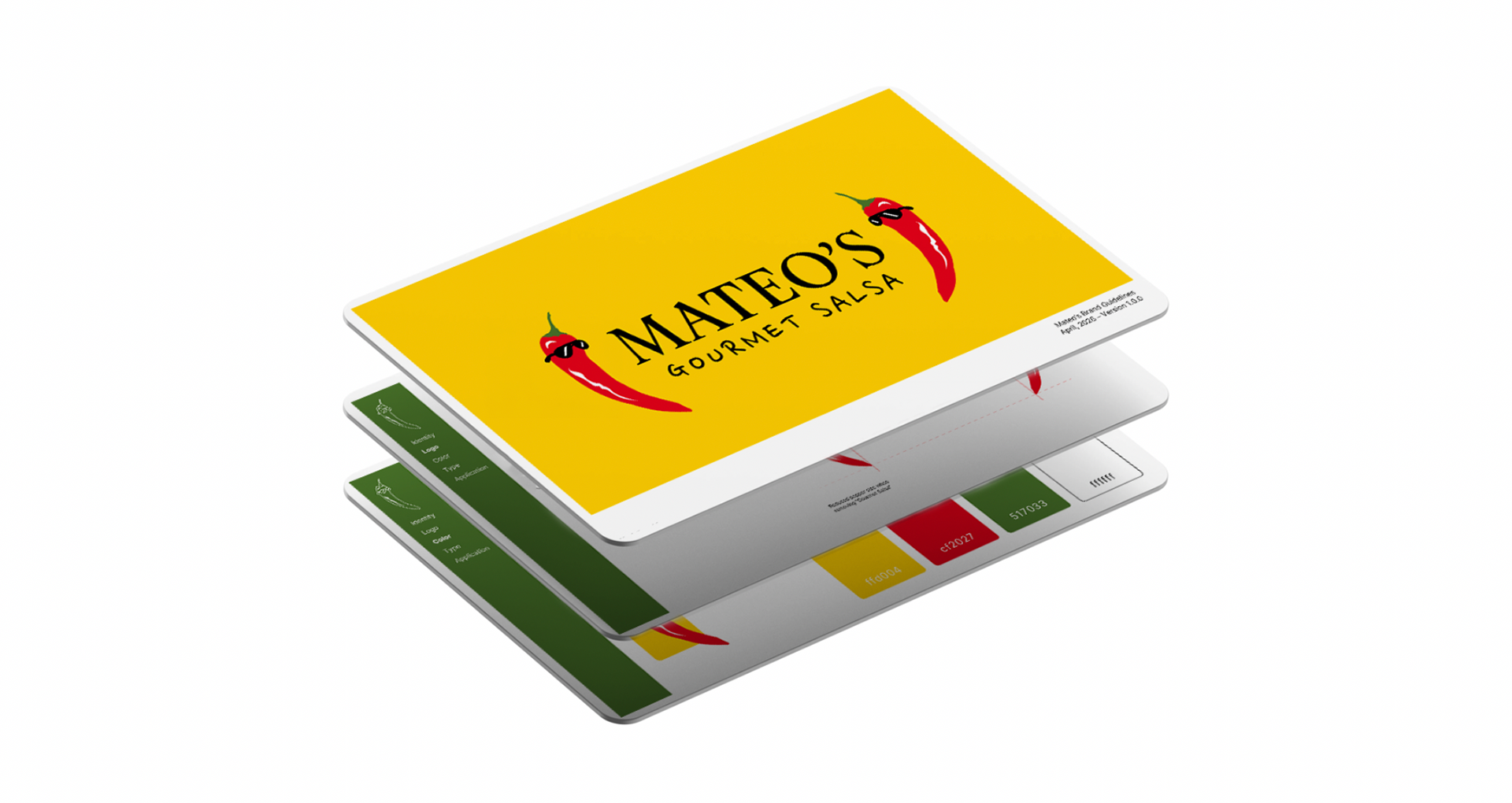
Mateo’s is a salsa brand known for its bold, fresh flavor, clean ingredients, and small-batch quality that they correctly describe as "uniquely different". In my graphic design course at the University of Arkansas, Identity Systems II, we were tasked to select a brand to redesign its packaging, and I chose Mateo’s to explore how its strong sense of authenticity and quality could be translated into a more cohesive, elevated visual identity that better reflects its values on the shelf.
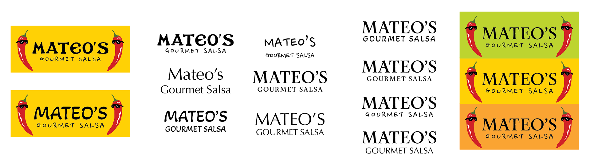
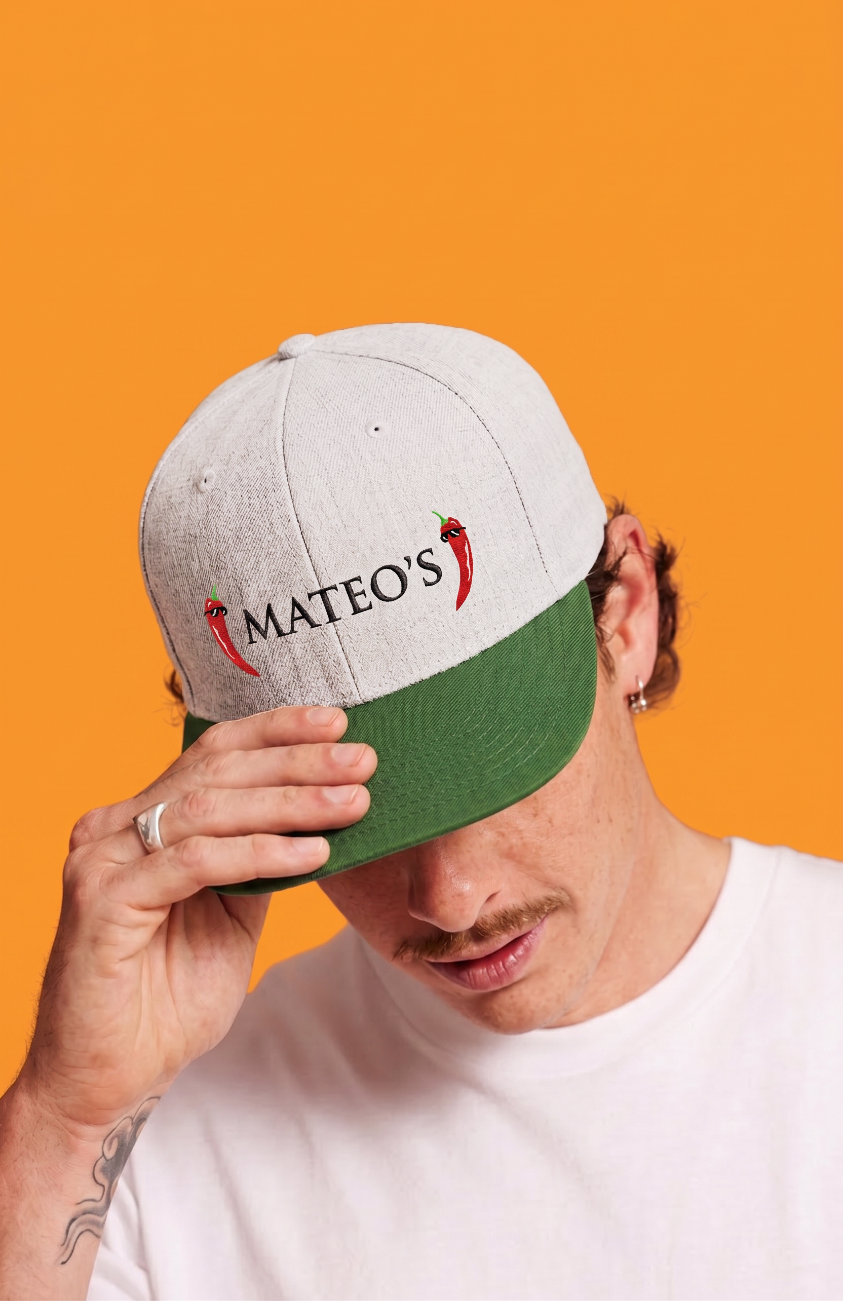
I Researched Mateo’s existing shelf presence and identified inconsistencies in hierarchy, typography, and flavor differentiation that made it difficult for the brand to present a cohesive system. Not only did I spice up their logo, but developed a refined packaging structure that clarified visual hierarchy through stronger typographic contrast, improved labeling organization, and improved legibility across all flavor variations.