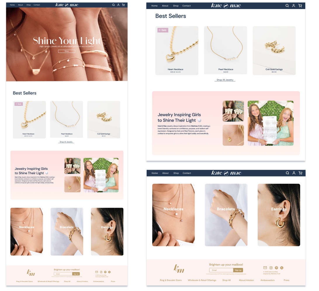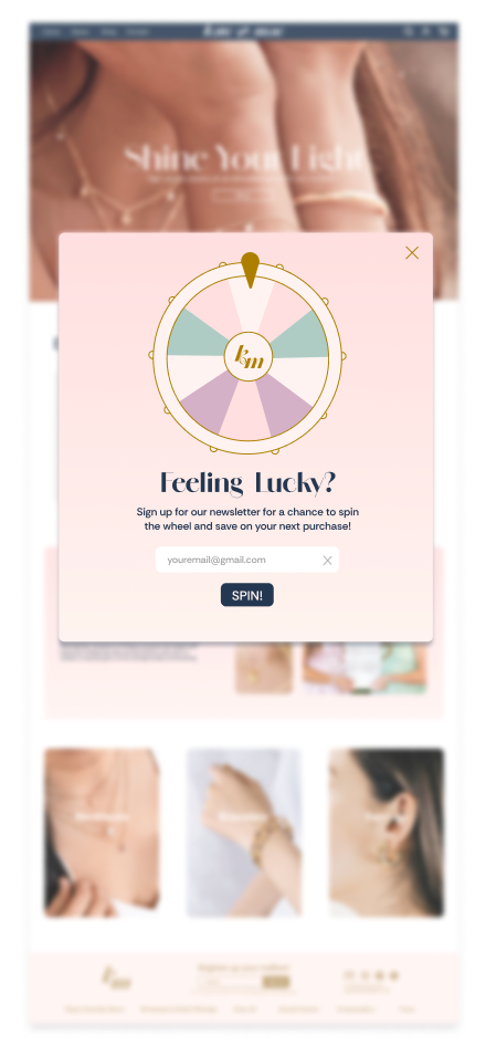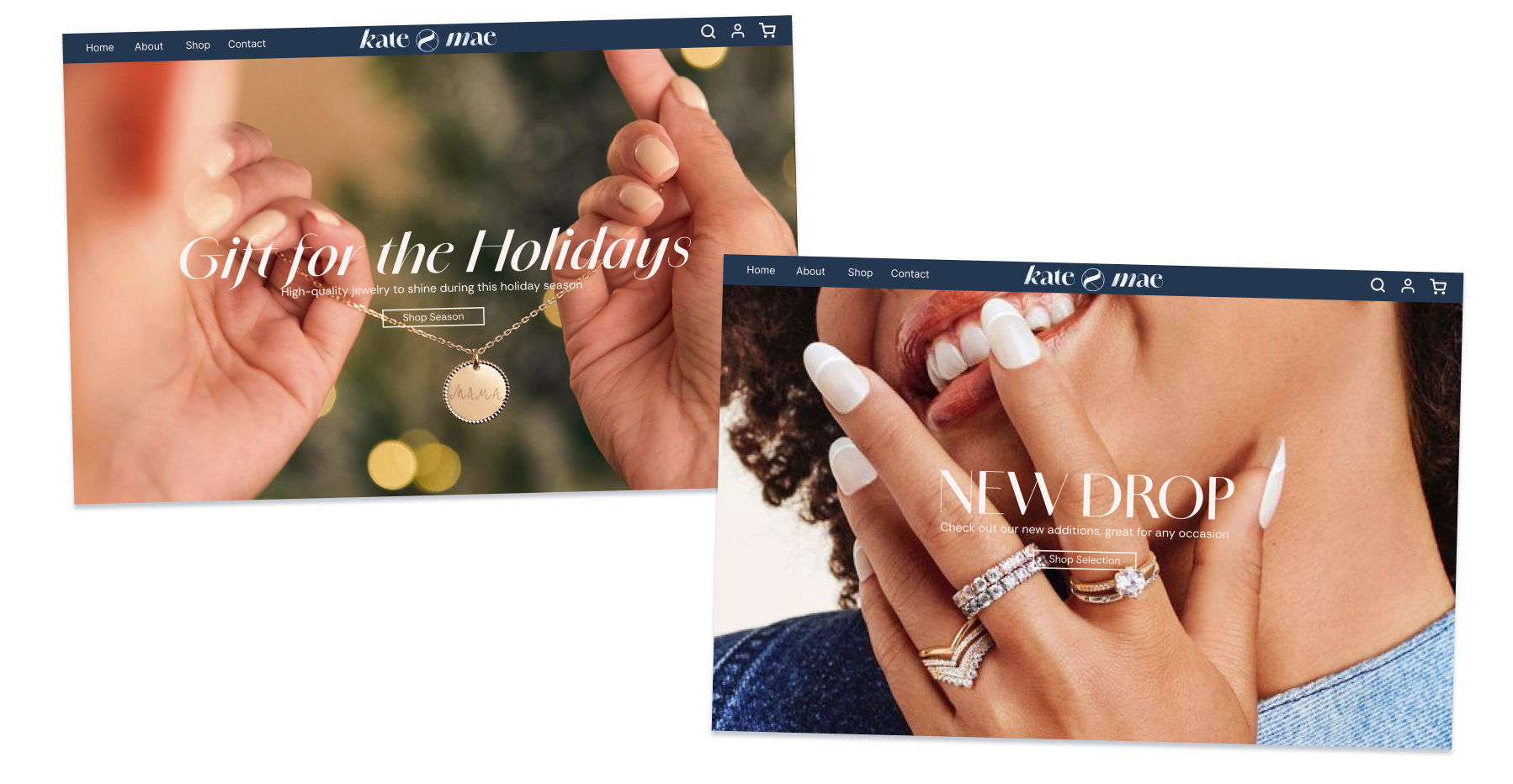
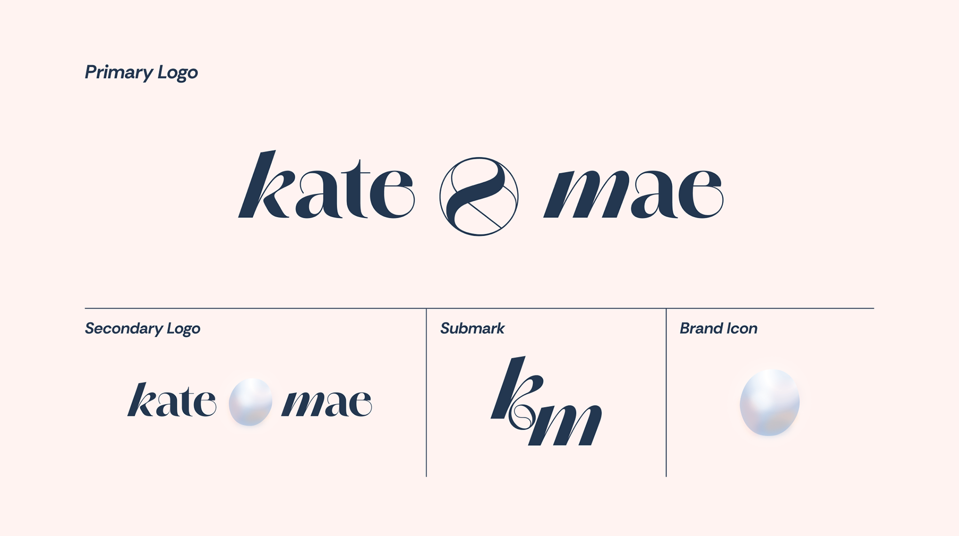
Kate and Mae is a jewelry brand created by two sisters, built around the idea of accessible, expressive pieces designed for young women and girls. My team of three other designers and I were tasked with working with Kate and Mae to present a possible brand direction to strengthen its storytelling, clarity, and overall digital experience.
A key conceptual direction we developed was the use of the pearl as a central visual metaphor, directly tied to the brand’s motto “shine your light.” We used the pearl to represent individuality, growth, and inner value. We designed a logo suite, color changes, website direction, and more. The final direction emphasized a more polished, cohesive brand system that still preserved the youthful, creative energy at the core of Kate and Mae.